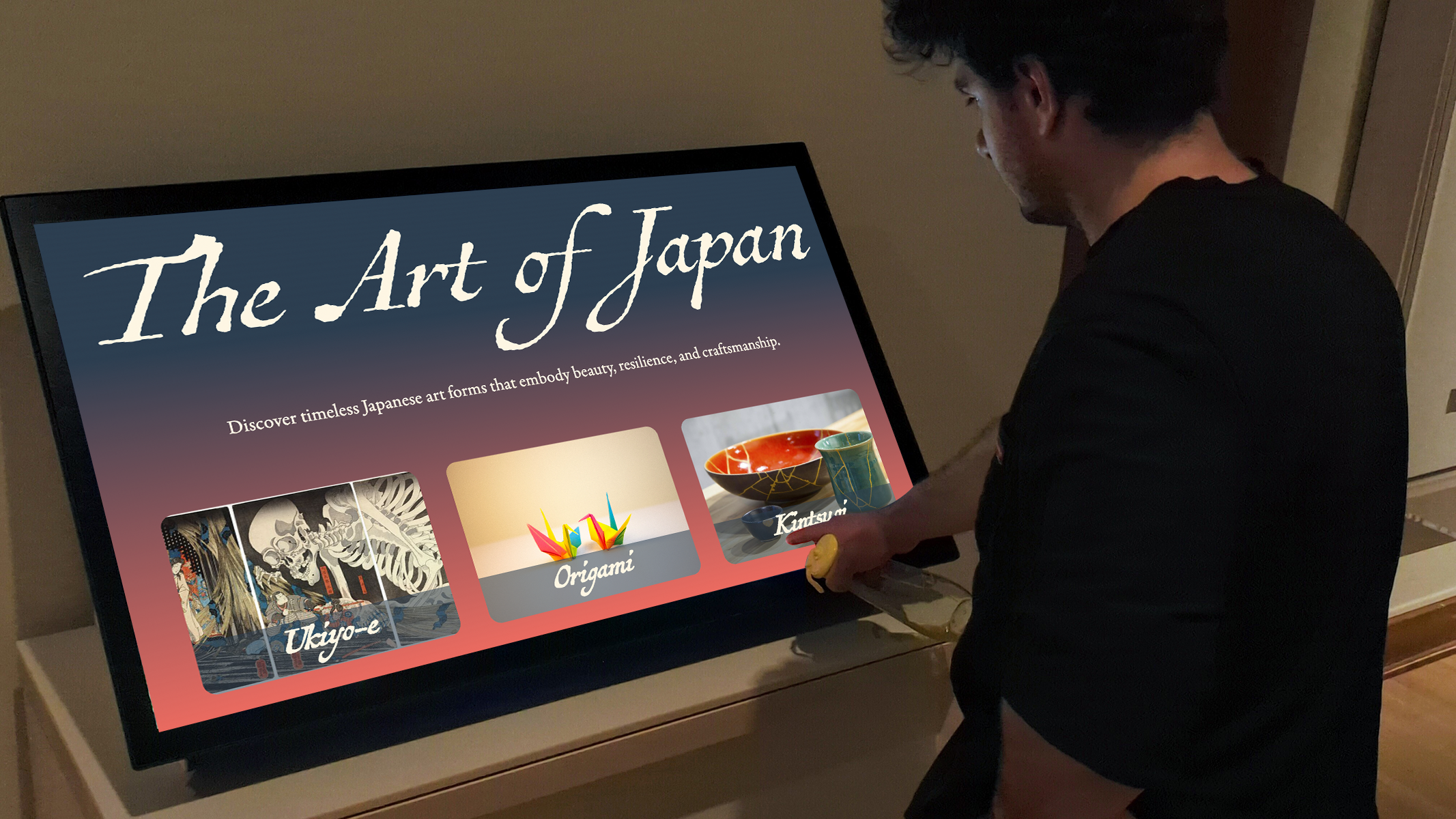
Designing a digital experience that brings ancient Japanese art to modern fingertips.
The Japanese Art Forms Kiosk is an interactive experience built for gallery spaces; offering visitors a calm, intuitive way to explore traditional art forms like origami, ikebana, and ink wash painting.
This wasn’t just a design concept. I built the entire thing from UI to front-end development as a responsive, touch-friendly application. The goal was to create something culturally respectful, visually refined, and technically smooth, where every interaction feels intentional.

This wasn’t built for a laptop.
it was built for a physical space. Every visual and interaction had to consider real-world use: ambient lighting, screen height, user distance, and mixed age groups. That meant larger text, generous spacing, subtle motion, and clear touch feedback.The interface had to invite curiosity without explanation. no learning curve, just a natural flow that anyone could step into.

The challenge was to make something simple enough for casual gallery-goers, but rich enough to do justice to centuries of artistic tradition.
Animations and transitions were used thoughtfully — not to impress, but to guide. Every motion was timed to feel soft and natural, helping users move through content smoothly.
Navigation was kept simple and linear, with clear category tiles leading to detail pages. Large touch targets and minimal content per screen made it easy for users to explore without feeling overwhelmed
The visual system was designed to feel quiet and balanced, inspired by traditional Japanese aesthetics. I used soft colors, clean typography, and generous spacing to create a calm and focused experience.
Designed specifically for gallery environments. soft contrasts for visibility in ambient light, no clutter, and performance-optimized for low-spec hardware.

The entire kiosk was designed and built from scratch, with close attention to structure, responsiveness, and user flow. I focused on keeping the experience smooth and lightweight, making sure it worked well on public touchscreen displays without any lag or visual clutter.Every screen, animation, and interaction was coded to feel natural and intuitive, from how content loads, to how transitions guide the user, to small visual details that bring the interface to life. The layout adapts across different screen sizes, and all interactions were tested to feel effortless on touch.
After building the main experience, I decided to expand the kiosk by designing full-screen flows for each of the three art forms Kintsugi, Origami, and Ukiyo-e. Each path includes a landing screen, a timeline-style history, and a page focused on the underlying philosophy of the art.I kept the visual style consistent with the main screen but let each section have its own material-inspired texture and tone- like gold gradients for Kintsugi and soft paper for Origami. so the user feels the difference without losing the flow. The goal was to go beyond surface-level info and make every section feel like a complete, self-contained journey.


This project taught me a lot about designing for real-world use. not just on screens, but in physical spaces where people interact differently. I had to think about how users would approach the kiosk, where their hands would go, what would feel obvious, and what might confuse.It pushed me to stay simple, stay clear, and be intentional with every design and code decision. From laying out content to structuring interactions, the goal was to keep everything calm, functional, and focused, no unnecessary steps, no extra noise.