Building a mindful, nature-first brand identity rooted in simplicity and balance.
Jeevit is a personal branding project that explores how design can create an emotional connection between people and nature. Focused on visual identity and storytelling, this project includes a brand book that defines the logo, typography, color palette, and application guidelines. Inspired by simplicity and sustainability, Jeevit embodies a lifestyle that encourages mindfulness, balance, and a deep connection with the natural world

I built the Jeevit wordmark with precise attention to proportion, balance, and whitespace. The construction grid ensured consistency in scaling and placement across use cases. from digital banners to stitched labels. The delicate curves and serif structure reflect the brand’s balance between strength and softness.
The challenge was to craft a calm, rooted identity that speaks without shouting one that feels as natural and grounding as the lifestyle it represents.
Earthy tones like Olive Green, Terracotta, and Sunlit Yellow to reflect nature's essence.
A clean, readable primary typeface paired with a character-rich secondary font to add personality on product packaging.
Minimal, elegant, and adaptable. built to sit quietly yet confidently on anything from gear tags to wellness posters.
Natural textures, soft gradients, and grounded compositions that evoke slowness, exploration, and wellness
I designed a full icon system to support brand messaging across gear, product categories, and digital platforms. These icons are minimal yet expressive, built to communicate clearly while staying consistent with Jeevit’s grounded visual tone.The system covers everything from weather adaptability and adventure types to wellness categories, making the brand flexible across physical products and content.
To bring the identity beyond the screen,
I created product mockups that explore how Jeevit would live in the real world from apparel to accessories.
Each piece uses the visual system thoughtfully, keeping the brand presence subtle, natural, and consistent.
.png)
Whether it’s a tote bag, t-shirt, or product tag, the goal was to maintain personality while blending seamlessly into everyday outdoor and wellness-focused lifestyles.


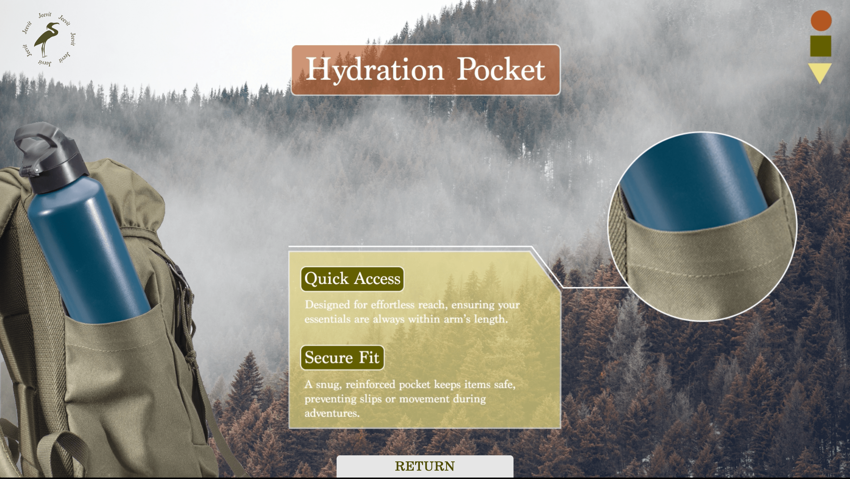
This was a product showcase I designed for the Jeevit TrailPack. a bag made for outdoor use. The idea was to let users rotate and explore the bag from all sides in an interactive way.I kept the layout simple and focused on the product. You can hover and rotate the bag to see it from every angle, which makes the experience feel a bit more real than just static images.It was a small experiment in making product displays feel a little more hands-on. especially for something built for movement and outdoor use.

This was a two-screen ordering setup where both vertical screens worked together. one showed the menu, and the other handled the order flow. The main focus was to make sure everything felt connected, so users wouldn’t get confused switching between screens. I kept the design consistent on both sides and tested the flow a bunch of times to get it right.It turned out clean and easy to use. quick for ordering and smooth to navigate.

Working on Jeevit helped me understand how much thought goes into building a brand that feels effortless.
I had to balance clarity with emotion. choosing the right colors, crafting a logo that feels grounded, and designing visuals that quietly speak for the brand without overexplaining.
More than anything, this project improved how I approach design problems. I didn’t just focus on aesthetics, I thought about consistency, adaptability, and how each element would feel across real-world applications. It taught me the importance of staying intentional and designing with purpose.